The Grouparoo Blog
Having clear and accessible navigation is huge for website conversions. Sites with poor navigation are frustrating to use. Nested navigation menus are a common way to help keep top-level navigation to a minimum, but they can have major usability issues. A better way to handle a large number of links in a dropdown is to create a mega menu. Recently, we gave our site navigation a face lift using mega menus.
Since both our core product and our website are open source here at Grouparoo, let’s dive in and take a look at how we built out a mega menu using our stack.
First, What’s a Mega Menu?
This!
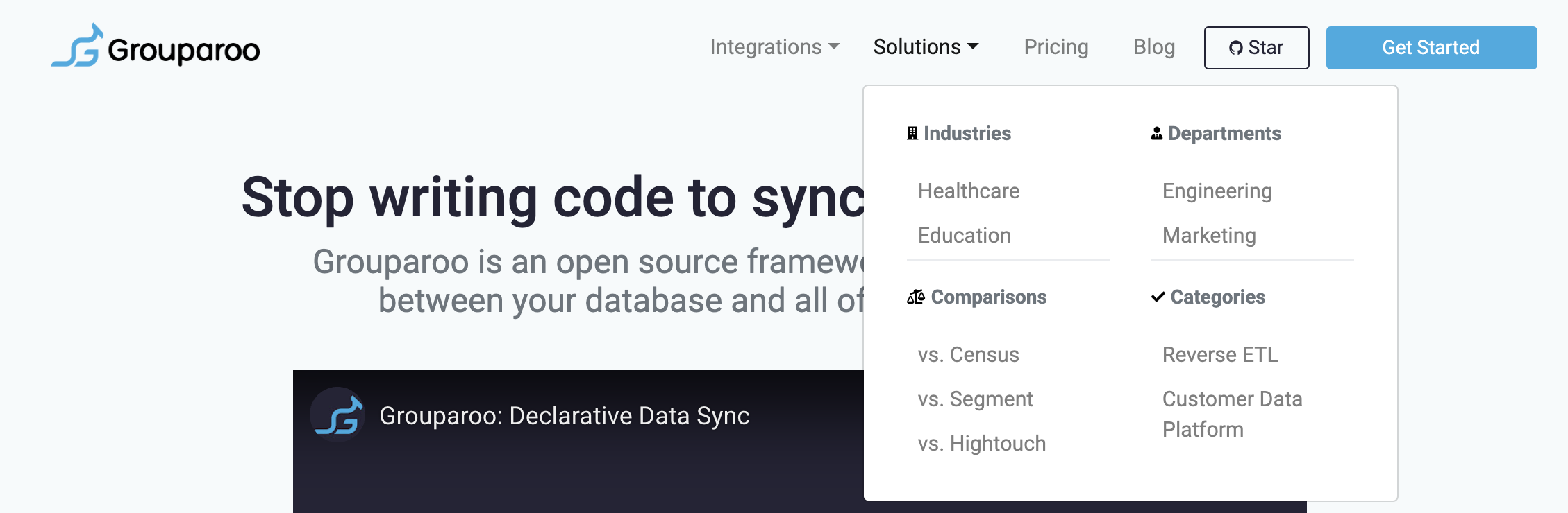
A mega menu is a way to have multiple columns (or more!) of items within your dropdown menu. Some key things to consider:
- Make sure you have enough items within your dropdown to warrant a mega menu
- Figure out how you want to arrange the items within your menu
Recently, we’ve been adding a lot of content to our site. We wanted to link more pages in our navigation, but still keep the top level navigation bar minimal. So we went with a mega menu.
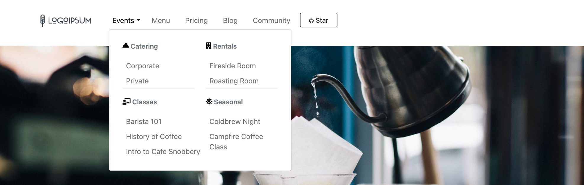
Let’s Build
For this tutorial, we'll be building this copycat mega menu:
We'll be working off a boilerplate project with NextJS, React Bootstrap, SASS, and Fort Awesome already imported and ready to go. Coffee themed, because of course.
React Bootstrap, and Bootstrap in general are great. The built-in components, classes, and utilities save a lot of time building responsive layouts, and they're accessible by default. They’re also super flexible. For those less comfortable with front end, Bootstrap's documentation is full of copy-and-pasteable examples to get started making modern, accessible sites. And once you've been working with Bootstrap for a while, it becomes almost second nature to Frankenstein pieces together like we're about to do.
💡 To get started, fork this
repo and npm install!
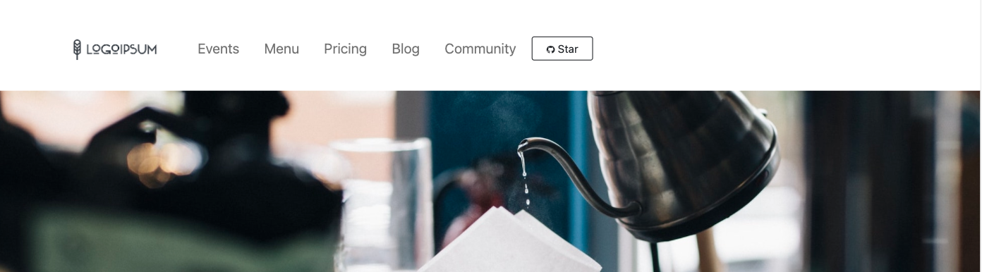
Here is our Navbar element starting out:
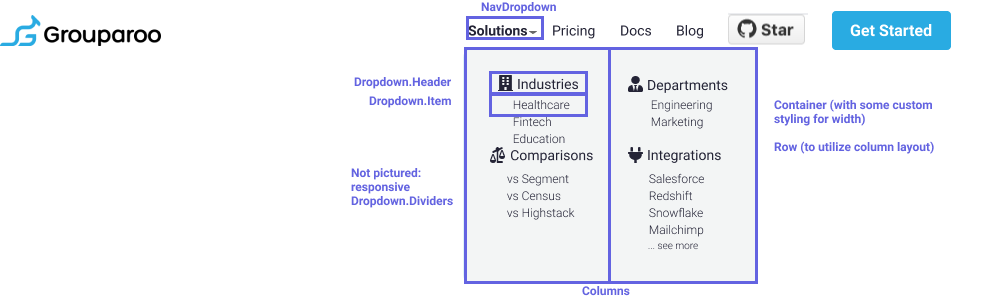
When developing our mega menu for Grouparoo, I started with this Figma mockup. From there, I looked at what React Bootstrap components to use. We did end up making a few design changes further into the process, but it all started with:
We're going to build something similar where the "events" link currently lives on our template.
Let's start by adding the following into /components/navigation.js in place of the current Nav.Link for events:
<NavDropdown
  className="pr-2 py-2 align-text-top"
  title="Events"
  id="basic-nav-dropdown"
>
  <Container className="eventsNav pt-0 mt-0">
    <Row>
      <Col xs="12" md="6" className="text-left">
        <Dropdown.Header>
          <FontAwesomeIcon
            color="black"
            icon={"concierge-bell"}
            size="1x"
            className="pr-1"
          />
          {"  "}
          Catering
        </Dropdown.Header>
        <Dropdown.Item>
          <Link href="/">
            <a className="nav-link" role="button">
              Corporate
            </a>
          </Link>
        </Dropdown.Item>
        <Dropdown.Item>
          <Link href="/">
            <a className="nav-link" role="button">
              Private
            </a>
          </Link>
        </Dropdown.Item>

        <Dropdown.Divider />
        <Dropdown.Header>
          <FontAwesomeIcon
            color="black"
            icon={"chalkboard-teacher"}
            size="1x"
            className="pr-1"
          />
          {"  "}
          Classes
        </Dropdown.Header>
        <Dropdown.Item>
          <Link href="/">
            <a className="nav-link" role="button">
              Barista 101
            </a>
          </Link>
        </Dropdown.Item>
        <Dropdown.Item>
          <Link href="/">
            <a className="nav-link" role="button">
              History of Coffee
            </a>
          </Link>
        </Dropdown.Item>
        <Dropdown.Item>
          <Link href="/">
            <a className="nav-link" role="button">
              Intro to Cafe Snobbery
            </a>
          </Link>
        </Dropdown.Item>
        <Dropdown.Divider className="d-md-none" />
      </Col>

      <Col xs="12" md="6" className="text-left">
        <Dropdown.Header>
          <FontAwesomeIcon
            color="black"
            icon={"building"}
            size="1x"
            className="pr-1"
          />
          {"  "}
          Rentals
        </Dropdown.Header>
        <Dropdown.Item>
          <Link href="/">
            <a className="nav-link" role="button">
              Fireside Room
            </a>
          </Link>
        </Dropdown.Item>
        <Dropdown.Item>
          <Link href="/">
            <a className="nav-link" role="button">
              Roasting Room
            </a>
          </Link>
        </Dropdown.Item>
        <Dropdown.Divider />
        <Dropdown.Header>
          <FontAwesomeIcon
            color="black"
            icon={"sun"}
            size="1x"
            className="pr-1"
          />
          {"  "}
          Seasonal
        </Dropdown.Header>
        <Dropdown.Item>
          <Link href="/">
            <a className="nav-link" role="button">
              Coldbrew Night
            </a>
          </Link>
        </Dropdown.Item>
        <Dropdown.Item>
          <Link href="/">
            <a className="nav-link text-wrap" role="button">
              Campfire Coffee Class
            </a>
          </Link>
        </Dropdown.Item>
      </Col>
    </Row>
  </Container>
</NavDropdown>
Here's where we're at:
It's all there... but obviously in need of some help. I applied a custom className
of eventsNav to the dropdown container knowing I'd need to add some SASS. It is
wise to avoid custom styles (inline or on a stylesheet) if possible when working
with Bootstrap as it can make debugging more difficult. However, sometimes, to strictly
override the Bootstrap styles, it's necessary. Add the following to /styles/styles.scss
:
.nav-link {
  font-size: 0.95rem;
}

#basic-nav-dropdown {
  font-size: 0.95rem;
}

#seeMoreLink {
  color: #607d8b;
}

#seeMoreLink:hover {
  color: black;
  font-weight: 400;
}
.dropdown-menu {
  padding: 1em;
}

.dropdown-item:hover {
  outline: none;
  box-shadow: none;
  background: none;
}
.dropdown-item a:hover {
  color: black;
}

.dropdown-item {
  height: 2em;
  padding-left: 0em;
}

.dropdown-header {
  font-weight: 600;
  padding-left: 0em;
}

@media only screen and (min-width: 600px) {
  .eventsNav {
    width: 22em;
    padding-bottom: 1em;
  }
}
Most of those rules are just visual adjustments to match fonts, remove text decorations, etc. The ultra important rule there is the final @media query that sets the width of .eventsNav. That rule is how we tell Bootstrap we want our dropdown menu's container a specific size.
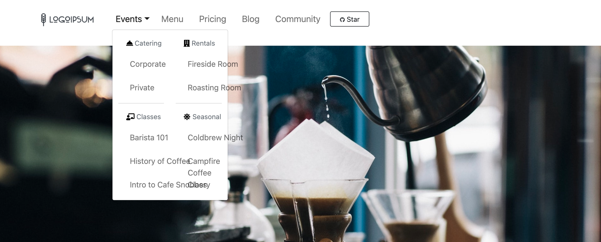
Et voila! A mega menu showcasing multiple categories worth of pages (all the links currently point to home, but they work!):
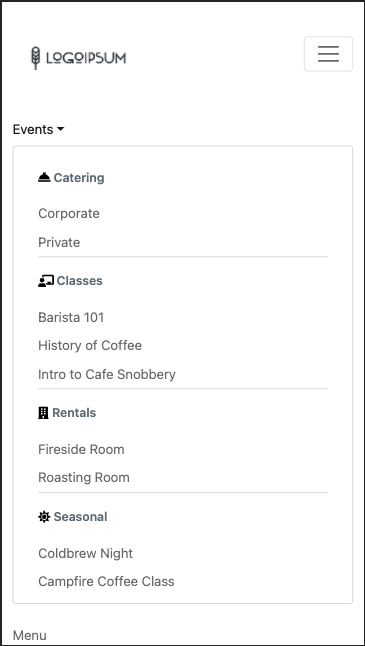
And on mobile additional divider divs appear and the columns expand to full container width. Again, Bootsrap's utilities for working with screen size breakpoints are 👌:
Check out the original version live here or star our site repo or core product to see more. Better yet, drop us a PR! We're open source!


Tagged in Engineering
See all of Teal Larson's posts.
Teal is a Full Stack Engineer at Grouparoo, an open source data framework that easily connects your data to business tools. Teal loves building products that solve real-world needs. If she isn't coding, Teal is probably riding her bike or nose-deep in a book
Learn more about Teal @ https://www.tealjulia.com


Get Started with Grouparoo
Start syncing your data with Grouparoo Cloud
Start Free TrialOr download and try our open source Community edition.